Arcagen Journal Entry #3: Design choices for a comic
2/4/20263 min read
When you begin a new comic, it's wise to create reference sheets for your characters, settings, or props. Keep in mind that you'll be illustrating these elements numerous times throughout the story, and if you're like me and value design consistency, you'll want them to remain "on model." It might be beneficial to conduct some research first, collecting inspirations, references, and experimenting with different iterations before finalizing your design.
But wait! Don’t fall on the mistake of spending too much time on this stage, because you might end obsessed on “how unique and original” they have to be. It’s important to have a memorable design, but your comic is more than pretty art. Think about the character interactions, the narrative, the pacing, the plot, and the soul of your story.
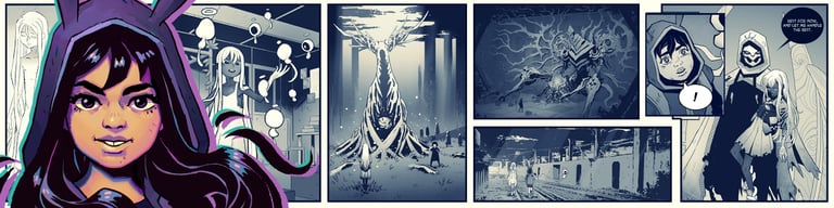
Also, be careful with the amount of detail. Every extra line you add to a character, location, vehicle or accessory is multiplied by how many times it appears on the page . Sum all that up, and you have many additional hours of work . Most people will overlook small details after the first time a design is introduced,. Remember, you are creating a comic to send a message, and more detail doesn’t mean more virtue . And by this I’m don’t saying “be lazy” with your art, just be aware of your designs decisions and how they will affect every panel you will create. During the development of Arcagen, I was aware of this “detail factor” for character creation, so I tried to simplify their designs as much as I could. For example, Paloma had black and white hair, and a zig-zag pattern on her hoodie. Now, her design is even more simplified, while maintaining a similar silhouette and theme.
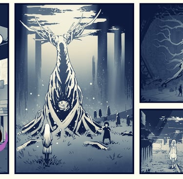
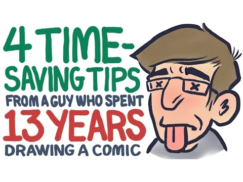
But what about the environments? Here’s where I stumbled. One thing is to make a post-apocalyptic city full of worn buildings, rusty billboards, broken streets and crushed vehicles. And then there’s a post-apocalyptic city that is being consumed by giant plants. The overgrown vegetation was part of the plot all along, but I never quantified how many extra hours I’d be drawing all that. After I developed the pilot for Arcagen, I knew I had to reduce the hours put on those backgrounds. I’m glad I watched this video by Lars Martinson, where the comic gives us tips on productivity after spending 13 years on a single comic project. Now, even when I kept the overall scenario of a city consumed by plants, I have greatly reduced the “stages” my characters will visit, and I’ve also reduced the detail on the vegetation. As you might have noticed, most of the plants in my story are black shapes made with a custom “bush brush” I created, and the giant roots of the first versions of the comic will be present only at key moments in the story.
I’m certain that I could further simplify several elements in my narrative to expedite its completion, but since I’ve already embarked on this (for real this time), I’m committed to the choices I made after the initial pilot. If I plan to implement new design alterations, I’ll ensure: a) They meet a requirement in the plot or b) Introduce them gradually, so they won’t be immediately noticeable. Now that I have somewhat resolved the design quandary, the next significant hurdle is crafting believable characters. I’m genuinely excited to begin lettering the conversations between Paloma and Lechuza…
To be continued…
(This is a repost from my old blog)
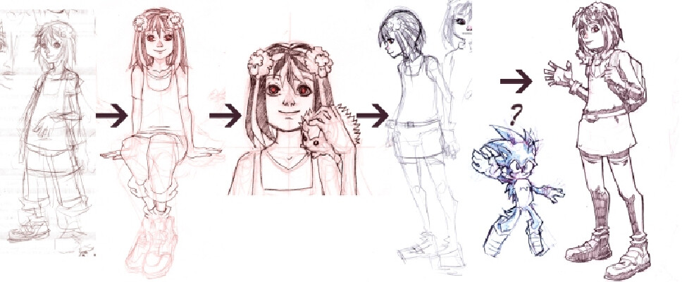
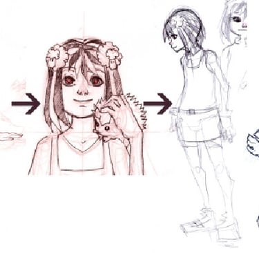
A design of Paloma from long ago. At that time, the narrative was meant to unfold before the city fell apart, showcasing Paloma as an ordinary student. Later, I revised the script so that the narrative would commence with Paloma already fighting for survival in a dying city.
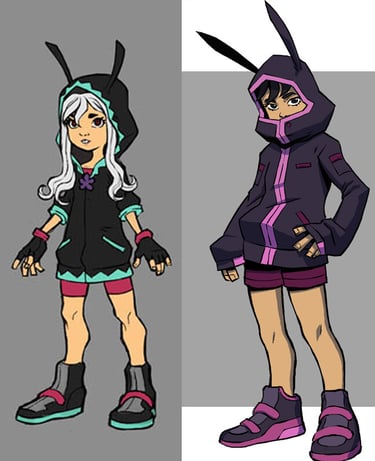
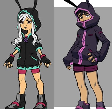
Old design (left) vs New design (right) of Paloma.
Navigation
Social media
©Arcagen is copyrighted material. 2025. All rights reserved.
Other Links
Terms and Conditions
Privacy Policy
Licensed under the Apache License, Version 2.0. Permanent Marker is a trademark of Font Diner, Inc. Copyright (c) 2010 by Font Diner, Inc. All rights reserved.